Monday, January 27, 2014

Psychedelia

In the 1960's an art style named Psychedelia was born. This style was distinguished through swirl designs, intense colour, abstract art, curvilinear calligraphy and use of drugs.
It was a time when Rock posters portrayed and encourages the use of certain drugs and sensory deprivation.
The psychedelic movement where influenced by fashion style, art, literature and philosophy and the way people spoke. Culture music were also effected by the development of the movement in this era.

Traditional cultural ad politics and materialism were questioned by youths. Through these changes youths were encouraged to grow ad emerge, seeking democracy in their society which freed them from discrimination.

Through these changes that occurred within the social culture and mentality became an inspiration to fashion and music industry as well as allowing artists and graphic designers to sprout and produce a unique creation of art.

Psychedelic art and design lasted a few years but its influence still remains and a new breed of artists draws in fresh exciting ways motivated by the classical work of the genre. Unlike the music psychedelic art occupied the counter culture never being welcomed by the art community of the day. John Huford a psychedelic artist in the 1960's recalls to 'It was frowned upon by the art establishment, in much the same way as freestyle graffiti was in 1980s'.
Artists that encapsulated 1960's psychedelia where Hurford, Gerald Scarfe, Alan Aldridge and Barney.


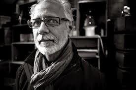
John Hurford  - Psychedelic Art


Bibliography

Meta, 2011. Psychedelic 60s. [Online]
Available at: http://visualartsdepartment.wordpress.com/psychedelic-60s/

Jan Tschchold

Jan Tschchold was a modernist typographer as well as a teacher and writer. He became well known and part of history when he showed and presented his typography book called ' Die Neue Typographie'.
Tshchold was against decorative conventions, rules for grids and layouts, spacing, proportion and composition.
By exposing himself to various methods he left many in astonishment by challenging traditional graphical concepts. He created and twisted different methods of arrangement. He became a modernist typographer and was a delight to many other artists.
By making use of his different methods and techniques it enabled others in their creative design and work such as brochures and magazine leaflets. Through theoretical discussions of typography Tschchold created styles which were applied in the design industry. After his success Tschchold began to design and illustrate several different layouts and typefaces. These designs gave him international recognition till today. A few of his work created in 1987 involve traditional typeface called Sabon.
During the emergent of the Swiss style symmetry, ornament and drawn illustration where replaced with plain sans serif typography and photographs. As printing became industrialized designers were allowed to become more experimental and produce more productive words. The New Typography is still of great importance to designers and art historians as it enables them to continue in their visual evolvement and communication throughout the twentieth century.


Bibliography

Dan, 2009. ESSENTIAL MANIFESTO: THE NEW TYPOGRAPHY, JAN TSCHICHOLD. [Online]
Available at: http://www.artintheage.com/essential-manifesto-the-new-typography-jan-tschichold/

Typography

Typography is an art performed by typesetters and typo graphics. Other professions who use this technique include compositions, graphic designers, art directors, comic book artists and graffiti artists. This technique of arranging type also arranges Type design and modifies type glyphs by using a variety of illustration techniques. Typography was considered a specialized occupation right up to t he digital age. However a new generation of visual designers and buy users emerged when digitization was founded.

A glyph is a particular mark on a written medium gives sense to what is written. A grapheme is made up of one or more glyphs. A typeface is usually made up of letters of the alphabet, numerals and punctuation marks. It was also consist of ideograms and symbols and may also include mathematical or map-making symbols.

Font is often confused with the term typeface. Before desktop publishing the two terms were more differed. A font can be a specific member of a type family such as roman, boldface, or italic type. A type face has an appearance or style from a family or related set of fonts.

Graphic designers assemble images together using typography ad motion graphics they create images and design. They also  create the graphics for published or electronic media, advertising and brochures.
They are also involved in the wed design illustration and typesetting of the job. It is of importance that once can access and be memorable.


References:

Kacee918, 2011. The Swiss Style. [Online] 
Available at: http://swissgraphicdesign.blogspot.com/2011/04/swiss-style.html


Alexander Rodchenko

Alexander Rodchenko was  a Russian artist, famous founder of constructivism who took a decision and acted upon an evolvement of a new movement. He joined forces with his wife Vanvera Slepanova, Karl Loganson, Konstantin Medunetski, Aleksei Gan and the Stenberg brothers and together they called themselves 'The Wolfgana Group of Constructivism'

Rodchenko experimented in several fields including paintings, sculptures, drawings, photo montage, collage. He also tried out photography, architectural projects and graphics on covers of magazines, posters and advertising ad well as fashion. He implied constructivism in several fields.
He constructed his first art work by creating simple shapes and forms and by applying primary colours. This experimental phase developed into an evolution where the combination of other multiple colours and shapes occurred which defined constructivism.
Rodchenko soon began to be influenced by architectural design. He began to create several abstractions by using a ruler and a compass. Through his work linerasim was able to be shaped further developing creation in 3D artworks.

By playing with these dynamics Rodchenko was able to create a 'static balance to constructivism'.
Rodchenko was also involved in a group of constructivism which created art with an intention to serve the social industry and cultural development, Rodchenko created designed film posters, magazines and book covers through photo montages and photography. By using geometric designs and simple elements and colour he produced propaganda poster. His typography was of a clear composition which allowed the viewer to understand the information that was published. 

Vladimir Tatlin described Rodchenko as 'an artist who created for years without and recognition and worked until death with great zeal and simple pure taste, for an unknown future'. This made Rodchenko a revolutionary artist.


Bibliography

ALI, S., 2010. Alexander Rodchenko and the Russian Constructivism. [Online] 
Available at: http://saharali.blogspot.com/2010/02/alexander-rodchenko-and-russian_5590.html

Constructivism

Constructivism started in Russia in 1919. This movement was artistic and architectural philosophy. Constructivist in the 1920, brought about new architecture, graphic design, films and photography. They paved the way for new design styles and man production techniques. These were aiding Russia to turn from a society of agriculture to an industrial one. Constructivist believed that all art and design was a tool for politics. 'Russia was their convas' a gigantic art project on a gigantic scale. World War 1 allowed several movements to flourish particularly constructivism. It is considered as on of the most important movements that has been created as it has created a turning point in history. Through many combinations the movement evolved and grew and further developed other developments such as Russian Supermatism, Italian futurism and Cubism and the Bauhaus school of Germany.

Constructivism soared its measures of abstraction by using basic shapes and non emotional experimental ideas. By applying this geometrical approach it was allowed to become modern and straight forward.

The idea of 'art for art's sake' was not welcomed by constructivism. These artists believed that art must have a reason to provide the communist party during the Russian Revolution.


Constructivism poster during the war

Bibliography

ALI, S., 2010. Alexander Rodchenko and the Russian Constructivism. [Online] 
Available at: http://saharali.blogspot.com/2010/02/alexander-rodchenko-and-russian_5590.html

Futurism

In the beginning of the 20th century in Italy an artistic and social movement originated. It was called Futurism and emphasized themes that were linked with the modern concept of the future. These themes included speed, youth and violence and technology. Other objects were the car, the aeroplane and industry in cities. Although other movements in Russia and England were involved it was mainly an Italian invention.
Several mediums of art were tackled by these Futurists such as sculpture, ceramics painting, graphic design and interior design. Also theatre, film, fashion, music and literature were some of the many that were practiced by these artists.
Some of these main artists were Boccioni, Carlo Carra, Gino Severini and Giacomo Balla. It was the Italian poet Filippo Marinetti that established futurism as a revolutionary movement after the publication of his manifesto of Futurism, He believed that all artists following this movement should test their ideas against the realities.
The manifesto spoke about the thirst for speed and modern life.
"We affirm that the world's magnificence has been enriched by a new beauty; the beauty of speed."
These artists challenged correct syntax and grammar and began a typographic revolution against classical tradition. This new design excluded harmony as it went against "the leaps and bursts of style ruining through the page."
The typography was "new and painterly" and they called it prole in liberta or 'words in freedom'.
Two conditions that were dominantly expressed in futurist poetry were noise and speed.

Marinetti encouraged poets to free themselves from being slaves to grammar and feel to express themselves more freely. He wrote "a man who has witnessed an explosion does not stop to connect his sentences grammatically but hurls shrieks and words his listeners,
This futurist expensive typography began to be practiced by poets. It was called pattern poetry, Often objects or religious symbols were used. Other patterns as varying word space or omitting capitalization or punctuation marks to emphasize were used to enforce auditory effects. In "Alice's Adventures in Wonderland" by Lewis Caroll 'pictorial shape' and 'descending tyre sizes were used to build a mouse's tail as part of the mouse's tale.


Filippo Marinetti


References:

Coen, Ester (1988). Umberto Boccioni New York: The Metropolitan Museum of Art.

David Carson - Grunge

David Carson an American graphic designer and art director as well as surfer is mostly well known for his modern designs in magazines and experimental typography he uses.
He applied most of the typographic and layout which gave him popularity in the magazine Ray Gun where he was the art director. He is also the so called Godfather of Grunge. This typography style was ubiquitous. He applied a simple method and twofold gospels "you don't have to know the rules before breaking them, and never mistake legibility for communication".
Carson used a particular technique which included ripping, shredding and redoing letter. This technique became nerve touching.
Type design was messy then. Words were chaotic and letters blurred. Thick and heavy textures were used and posters for concerts where like splattered in paint and band names scratched out. This style of typography was the grunge.
Like many of the best things of the 90's the grunge typography was discontented by many. It arrived as a backlash just like how punk music came in. As Carlos Segura, a Chicago based graphic designer put it "It was almost like a societal complaint".
Segura witnessed closely the explosion of the grunge. Designers like Segura felt that everything was getting too clean and that David Carson's design was easy to follow so everyone started to do that 'David Carson look'. The loo was refreshing for some time because it was innovative and new.

Carson used tactics that made his typography easy to be applied by technology.
The popularity of the grunge typography clashed with the famous Macintosh which in 1984 changed the field of graphic design and typography.
Designing art by hand a 'painful craft of precision and consistency' no longer became the only method. Another option was born. Designers felt freed. They now only had to use their imagination and put it on screen. Young typographers in the 90s were fuelled with new software and ideas which they experimented with. They pushed aside rule based fonts which designers before them produced.


Ray Gun magazine - David Carson


Carlos Segura


Bibliography

Neli, 2013. David Carson - The father of Grung. [Online]
Available at: http://nvtodorova.wordpress.com/2013/10/16/david-carson-the-father-of-grunge/

Wednesday, January 22, 2014

Post Impressionism

Post-impressionism is the term used to describe the development of French art since Manet. It was a British artist and art centric Roger Fry who invented this term whilst he was organizing an exhibition Manet and the post impressionists in 1910. post Impressionists went beyond limitations. Vivid colours continues to be used and paint was applied in thick layers, and "real life subject matter". However geometric forms were mostly emphasized to change the meaning of expression and to random colour mainly unnatural.
Post Impressionists were not impressed by the lack of detail and unimportant subjects that Impressionists portrayed in their paintings. Pointillism was created by Georges Seurat who used tiny dots of colour systematically to create art. In order to "make the  Impressionism something solid and durable like the art of the museums" Paul Cezanne was one artist who tried to restore a form of "order and structure to painting". This aim was attained by converting objects to their simple shape however allowing the use of the exclusive combined colours of Impressionism

Camille Picasso, an Impressionist investigated Pointillism after he was dissatisfied by what he described as romantic Impressionism. He referred to Pointillism as "scientific Impressionism" . After experimenting with Neo-Impressionist ideas He returned to Impressionism in the last tn years of his life.

Artist Vincent Van Gogh conveyed his feelings and state of mind by using vibrant and colourful swirls of brush strokes. Even though Pot Impressionists artists often had exhibitions where their works were combined and shown together these artists disagreed on a 'cohesive movement'. The 1890s and early 20th century saw young painters work in completely different regions around the world and in many different styles and categories such as Fauvism and Cubism.


References:

Voorhies, James. "Post-Impressionism". In Heilbrunn Timeline of Art History. New York: The
 Metropolitan Museum of Art, 2000–. http://www.metmuseum.org/toah/hd/poim/hd_poim.htm 

The Evolution of Art Nouveau To Art Deco

Art Nouveau is a refined style created from the combination of Egyptian style and floral Japanese prints.

Art Nouveau started out with a floral definition however in the 1920's Art Deco was created by a group of rebellions and Art Nouveau was soon eliminated by the introduction of bold, geometric linear shape designs. This style was less decorative but very stylish. Its influence was brought by the modern art movement and the film industry.

Art Deco is made up of several characteristics the main ones being futurism, cubism, constructivism and neoclassicism. All these encouraged the growth of abstractism, helping several modern artists such as Hoffman and Frank Lloyd Wright.

In 1909 machinery was progressing vastly. The Futuristic movement were longing for a modern lifestyle and were influenced by the expression of speed and movement.

Simplicity was the message they wanted to portray in their composition and they worked to show this by creating composition of order and harmony. Typography therefore evolved and through these arrangements new forms and designs were created. Although most of their new font typefaces were linear and lacked sense they somehow still portrayed a sense of expression.
Unberto Soccioni, Carlo Carra, Giacomo Balla and Gino Severini are artists who were inspired by cubism and speed.
This inspiration led these artists to implement certain characteristics in their modern design art works allowing them to portray lines of force, repeat motifs and the addition of typographic elements.


Carlo Carra - Funeral of the Anarchist Galli

Carlo Carra's works of art expenses the amount of tension that was occurring during his era. The chaotic scene portrays several bodies in abstract movement, anarchists clashing and police with black flags in the air.

As technology and art continues to evolve striving for a modern lifestyle a movement called Dada was created. Their aim was to destroy art and attack it through their own meaningless form of art. The exploration of objects was enabled by subverting images to collages and photo montage thus creating a whole modern style.

Bibliography

ink, F., 2009. Futurism at Tate Modern. [Online]
Available at: http://fugitiveink.wordpress.com/2009/09/29/futurism-at-tate-modern/

S., A. A., n.d. Berliner Plakat. [Online]
Available at: http://www.pinterest.com/ariefadityawan/berliner-plakat/

International Typographic Style

International Typographic Style started out in Switzerland. This Swiss Style began in the 1950's and its aim and features are cleanliness, readability and objectivity. This type of style is characterized by its asymmetric layouts and 'sans - serif' typefaces as well as ragged right, flush left feel and the use of grids. Photograph played an important part. Its use and placement gave a uniqueness to this style allowing illustrations and drawings to be replaced by images.

Two Swiss well known graphic design artists and typographers attended the 'Schule for Gestaltung Basel', a school of design Armin Hoffman and Emil Ruder, where whilst at the faculty Emil Ruder came out with an excellent idea. His idea involved the publishing of a book which was to contain the grammar basics of typography and the book was titled in his name Emil Ruder. This brilliant idea allowed the Swiss Style to be published and hence it became the basic text used in Graphic Design and typography programs in Europe as well as North America.

Emil Ruder a Swiss graphic designer has equivalent work when compared to Armin Hoffman's designs. He uses gridwork which has influenced the development of web design. His particular style is used in today's society, enabling companies to redesign thir looks in a fresh, simple, bold and orderly manner.


A poster for the theatre production- "Giselle" designed in 1959

Armin Hoffman's graphic design is well known for his combinations of text and imagery. His graphical designs are inspirational as they are minimal slightly surreal and his combinations of imagery and typography are innovative. The tight kerning on the typography and the transparent, slightly blurred image of the ballerina enable the whole composition to be composed appropriately.


References:

Meggs, Philip B.,2006. Meggs history of Graphic Design. Hoboken, NJ, J Wiley and sons

Anon., n.d. Graphic design, 1945–75 The Internation Typography Style. [Online] 
Available at: http://www.britannica.com/EBchecked/topic/1032864/graphic-design/242772/Graphic-design-1945-75?anchor=ref845121


Post Modernism Presentation

In the beginning of the twentieth century there was a radical change in the lifestyle of humanity. This was a huge advance in different aspects of any individual. This development came in social, political, cultural and economical advances. Europe was no longer a monarchy but instead we see democracy, socialism and communism taking place. We also have a huge advance in technology. The introduction of the motorcar, the wireless radio, feature films, the airplane and manufactured art materials. It was an era of experimentation and innovation. This changed how people started to look at the world and how artist started to look towards art. Such advances made it so much easier to artists to get their hands on different materials and technology in order for their creations. The philosophical term “Cogito ego sum” which means “I think therefore I am” plays an important role towards how artists started to go towards their artistic notions. Such terminology was persuaded artists to ignore spirituality and what was done in the past in order to create new art. So we started to see a different art movement evolving that effected the graphic language. In Modernism we see a rejection towards traditional and decorative design. Everything is stripped off from such thing. Designers started to go towards functionality, simple and clean cut designs. One also sees the use of bold geometric shapes, primary colours, non-symmetrical design and the use of the idea of “less is more”.Post Modernist believed in the theory “less is a bore” unlike the previous movement Modernism. Post Modernism reacted against this movement (modernism) and basically rejected what it had to say to say about design and history.
In this art movement artists started to challenge the term “form following function” and also started to use past references in order to create something new. In the graphic design word this was being referred to as the “New Wave.” Characteristics of Post Modernism were taking concepts and styles form other artistic periods and mic them with new designs in order to have an original design, Also such era made artists and designer want to break the grid, rules and make use of collages. In this period of time we see artists like Andy Warhol playing a huge role of using references to his artwork such as objects that where very common to find at that time and icons of that time also. We also see Wolfgang Weingart, one f the most influential people in postmodern design. He took the Swiss Design and edited and made his own.


Andy Warhol - Marilyn Monroe


The Stanford Encyclopedia of Philosophy. 2014. Plato.stanford.edu ONLINE [Available at: http://plato.stanford.edu/entries/postmodernism/